Today, as in the past, one of the most refined and appealing colours.
The rosè hue enhances the creations of Barovier&Toso, for people with a taste for
timeless, delicate and elegant colour combinations.

“I believe in pink” is one of the most famous mottos attributed to Audrey Hepburn, the international icon of cinema and fashion. In one of her most memorable films, Funny Face, Kay Thompson sang “Think pink!”. Vibrant, luminous, exuberant: pink meets with the approval of a very wide audience. Apart from such outstanding endorsements, pink has gained a rightful place of honour among all colours.
Aside from anecdotal verve, today pink is a universal, trendy hue in many sectors, from design to beauty and fashion, taking on a wide range of shades: peach, powder, salmon, coral... In recent years, three pink touches have met with remarkable success - Rose Quartz, Millennial Pink and First Light - adorning everyday useful objects, walls and furnishings.
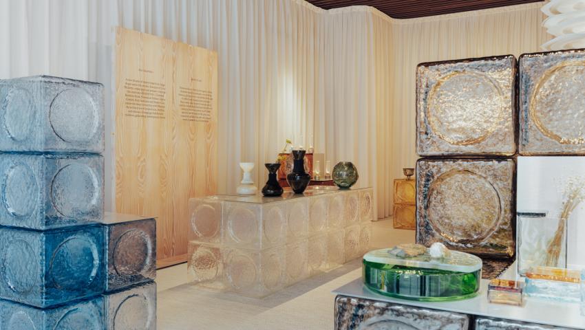
One entire setting has been devoted to pink by Barovier&Toso, inside Palazzo Barovier. The museum-showroom, in the midst of the Venetian Lagoon, contains a café totally wrapped in rose tones and embellished with the opulent, sophisticated forms of the Première Dame and Président chandeliers, made with light pink Venetian crystal.
Cherished and highly acclaimed, pink has always been a fascinating and exclusive colour, and its history reveals that fact that in certain phases it was literally a hue for the privileged few.
In the 1400s, Venetian merchants began to import a colouring known as “red wood” from Asia, and this was the moment when the Venetian courts began to take on a rosy tone. Shortly thereafter, the rest of the peninsula and Europe, especially France, adopted pink as the nuance of the moment. It was still a luxury, however, the “stuff of nobility”, because dying fabrics with rose tones was far from simple, and quite costly. Besides garments, pink made inroads in the world of décor and the figurative arts.
Also in the 1600s and 1700s, aristocrats made widespread use of the colour, which began to take on gender connotations. Many paintings show that it was used to dress young males, as it was considered the younger sibling of red, typically associated with force and war, as opposed to blue, which was thought to be more demure and feminine.
The revolution did not come until the 1900s, when in the Forties the producers of children’s clothing, in the United States, decided to associate pink with girls and blue with boys, arbitrarily dictating this dichotomy which then became very widespread.
Perhaps it was precisely the world of interior decorating and design that once again allowed pink to freely spread, shifting from a feminine colour to one utilized by all, applied without distinctions to homes, showrooms and glamorous spaces of all kinds. The light pink colour has always been a favourite for the creations of Barovier&Toso. The genteel charm of this shade goes well with the transparency of Venetian Crystal, generating spellbinding dazzle.
This is made possible by the master glassmakers, with their great experience and the passion they put into the practice of this true art form. It is not easy to achieve such a delicate, elegant colour in glass, and it requires great skill and know-how, as well as extraordinary sensitivity on the part of the craftsmen.
The popularity of rosè comes from its ability to be exceptionally versatile. Its presence is subtle, light, blending into and softening the décor, without ever being aggressive. Similar characteristics can be found in two other colours from the Barovier&Toso palette: amethyst and violet, where the former is ethereal and nuanced, while the latter is more forceful and intense. Both are extremely refined, and add a regal touch to the creations of Barovier&Toso, bringing magnetic allure to any atmosphere.
SECRETS FROM THE FURNACE
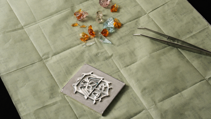
Knowledge and skill: experience suggests the mixture ingredients and gestures, guiding the gaze. Even the tiniest details are important. Deep knowledge of raw materials, techniques and all the secrets concealed in the magic of glass is indispensable. Behind pink Venetian crystal there is a process of workmanship involving many variables, which can only be controlled by great expertise.
The rosè colour is produced by selenium, which is also used to obtain red hues. Gauging the correct quantity and predicting the loss of chromatic intensity caused by tempering represent fundamental steps. Manganese, on the other hand, is used to obtain amethyst and violet tones, which behave differently in the cooling phase with respect to the rosè hue.
HNTS&TIPS
The Venetian Lagoon also takes on rosy highlights each year, when it hosts a large population of spectacular pink flamingos. This is a completely natural phenomenon of migration, which has taken place over the last ten years or so. An enchanting gift of nature!